
Recently, my accuracy typing on the iPhone has decreased. I looked into replacing the standard keyboard and found a solution that reminded me of the first time I used Tableau Software in 2009.
The Typewise keyboard is radical enough that most people will probably think it’s too complex to learn. For example, there’s no backspace key (swipe left anywhere) or shift (swipe up on the letter).
Without covering every operational detail, let’s agree this is innovative! The Typewise team freed themselves from incrementally improving the standard QWERTY keyboard. They intuitively transformed the user experience and reduced effort (load on the user).
Data visualization is not the activity of making charts
With the growing pressure to boost data literacy, we practitioners must embrace and apply similar thinking so our customers (users) can get insights faster with less effort.
While it’s important to follow best practices and write with the principles of the language of visualization, these are the basics of what’s expected. To have more impact, you have to look at the problem differently.
Consider these points to jump-start your innovation mindset:
- Don’t be limited by what you know today. Imagine the dream solution, then try to make it happen. Executing 80% of a better solution is a great deliverable.
- Where can you make it easier for the user? Lower the data-ink ratio, remove clicks, eliminate scrolling, reduce eye movement.
- Eliminate any expectations that the user should know how to operate the software. To them, it’s just charts on a web page.
The Scourge of Scrolling
Scrolling slows down analysis. You can’t see all the data at once, you don’t have a sense of the range of data, scroll and you forget what you just saw, etc…
What’s the easiest way to eliminate scrolling … make everything smaller, fonts, spacing, visuals, etc. No! This is a bad user experience.
The cause of scrolling is too much data to fit in the available space. The possible areas where we can innovate include – and you can combine these:
- Increase the available space
- Reduce the amount of data
- Make better use of the available space
- Change the visualization model
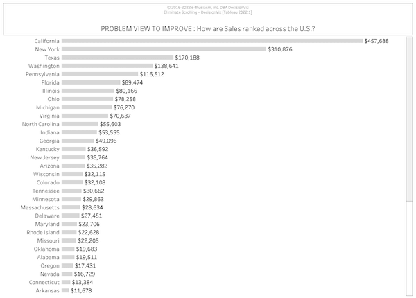
In our case, #1 ,#2, and #4 are fixed. Here’s one solution thinking about option #3.
This improves the original design, and as a bonus, uses less space.

Ready to improve your data literacy?
- Schedule a free, no-sales-pitch, review » http://decisionviz.pro/review25
- On your next dashboard, consider how you can apply at least one of the three innovation approaches. Get started, and you’ll continue to challenge yourself.
- I’d love to hear about an innovation you delivered. Hit reply and let me know (or if you’d like a copy of the workbook).
Excelsior!
Lee
Rewriting How People See Data™
PS I’m attending TDWI Orlando. Let me know if you’ll be there too.
PSS Get the Typewise app
Frustrated By Low Dashboard Adoption?
Learn how to transform passive charts into action-oriented visuals.
