
1. Making Your Buyer Do Math Is Just Mean
I was recently on Amazon stocking up for my storytelling workshop at TDWI and found these options on the Bic store. You’d think Amazon would be better with numbers.
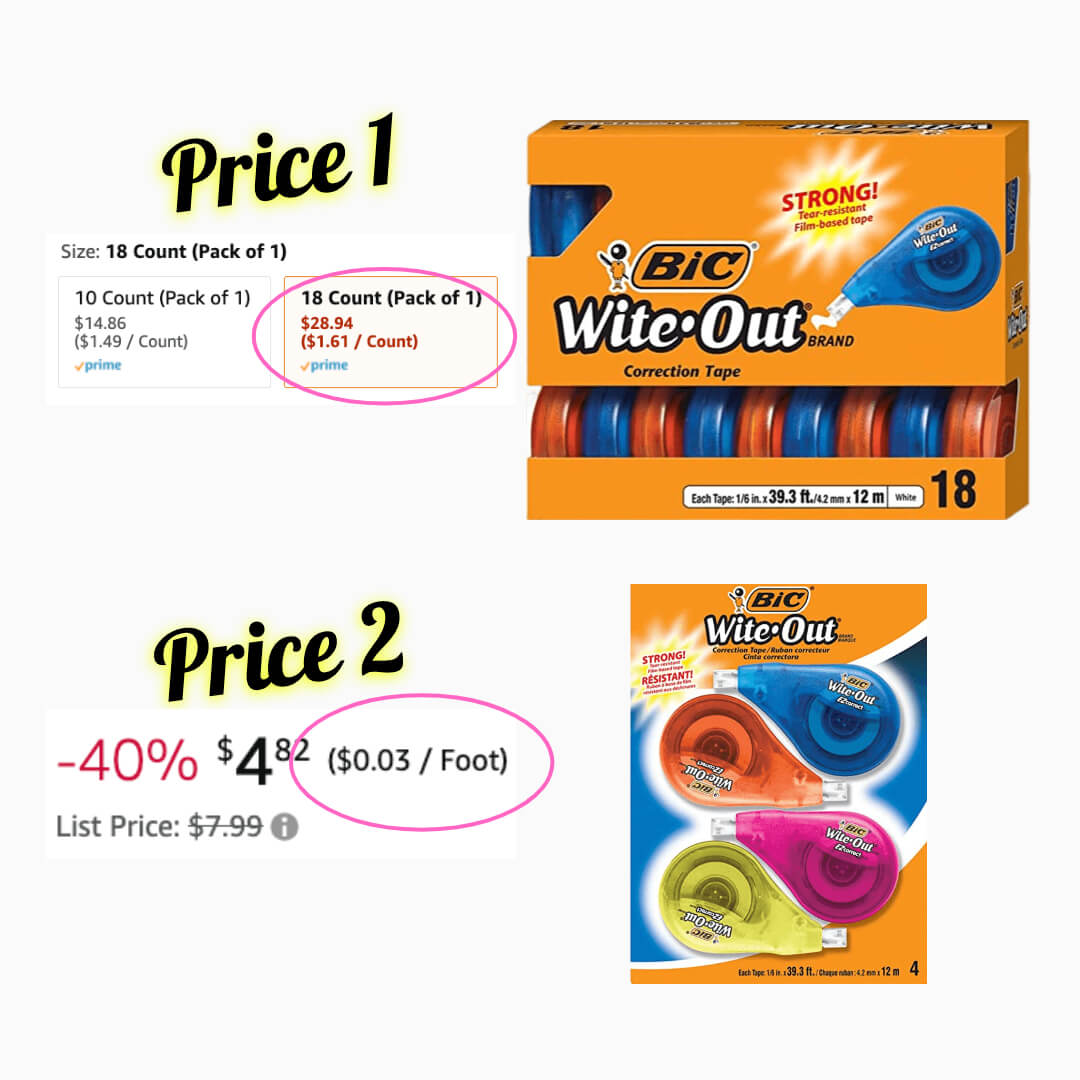
I thought it was a strange to present Price 2 as cost / foot. Argh, now I have to do math.
$4.82 / 4 = $1.21 per unit, a much better deal than $1.61!
Generally, people assume buying in volume is the better deal.
There’s a good chance people wouldn’t bother with the math – and picked the worse option.
Is this an insidious way Bic leads people to spend more?
While not directly Amazon’s fault (Bic designed the product listing) they could at least suggest a standard pricing model.
At work, make sure to have consistent definitions of information and how teams visualize the data. This is the most basic work in building a data literate organization.
2. Two Numbers You Cannot Subtract From Each Other
Here’s another common case of bad numbers I see often.
I’m a huge Marvel fan (She-Hulk Ep2 tonight!). I was reading some reviews of the latest movie, Thor: Love and Thunder, and this caught my attention.

The difference between 78% and 47% is not 31% – it’s 31 ppts (percentage points).
Showing 31% at work is incorrect and would create an aura of significant growth! It might be an honest mistake from lack of data literacy – or on purpose.
It’s critical to represent your information properly for retaining trust. Look through your work to see where you may need to update results with ppts.
3. Underperforming Performance Metrics
Let’s address one more common problem, with big implications.
When it comes to comparing data visually, here’s what I see at most clients.
A typical business measure is profit margin – the ratio of profit to sales. A standard visual is a table or bars listing all products and the ratio.
While useful, this single value is one part of a much bigger story behind the data.
I call this the Treachery of Averages™. Ratios are averages. Here’s a basic case:
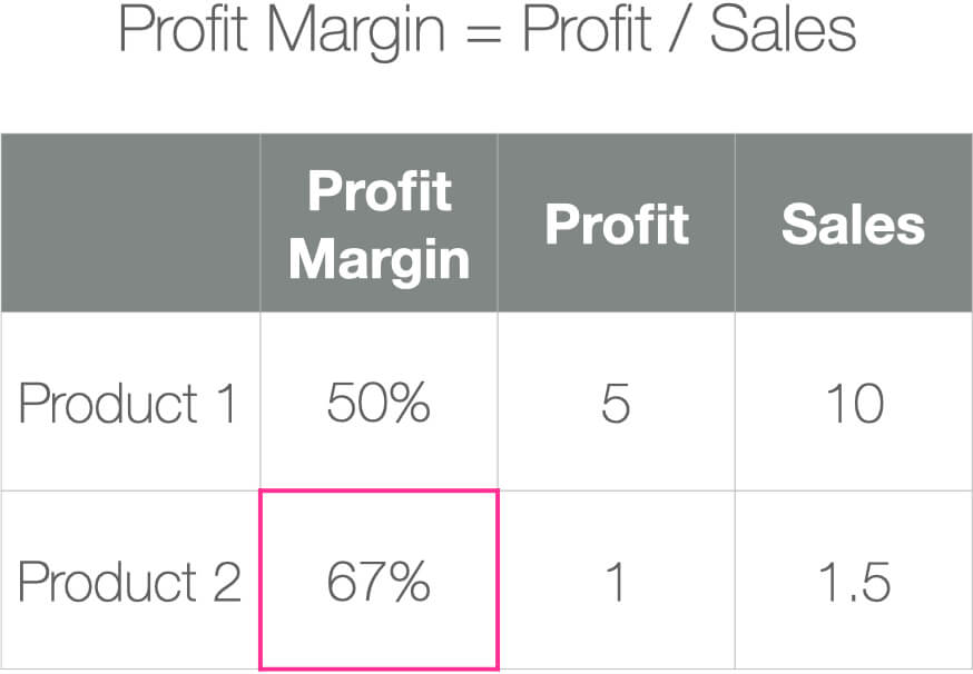
If you looked at the profit margin alone, you would be inclined to focus on Product 2, which has a much higher Profit Margin.
However, once you see Profit and Sales, Product 1 starts to look like it deserves more attention. Use the proper amount of data so that the complete story is presented.
Do you see these kinds of problems? Comment below and let’s chat.
By the way, this is why I wrote The Complete Guide To Visualizing Actuals vs. Targets In Tableau.
Learn better ways to report performance and boost your data literacy.
Best,
Lee
Rewriting How People See Data™
Frustrated By Low Dashboard Adoption?
Learn how to transform passive charts into action-oriented visuals.
