
I apologize for not writing this article sooner.
The industry leaders in data are setting bad examples that practitioners will follow.
While I admire their work to promote data literacy, their teams are quite illiterate.
Would you disagree that Google should know the basics of data visualization?
Unlikely – they are one of the largest data companies in the world.
I don’t expect perfection, but this chart on my Google Analytics home page is harmful.

Why do you think I’m SMH (shaking my head)?
a) Remove tick marks on the x-axis; they don’t add clarity
b) Each segment will be easier to see with a white border
c) Never encode categorical data as gradients
The answer is all of the above, but c) has me most frustrated.
The brain expects gradients to be assigned quantitative data (values).
In a stacked bar chart like this, use unique hues like blue, green, etc…
Side note: One day I’ll write about alternatives to the stacked bar chart.
Google wrote software to generate their chart. Unfortunately, modern business software lets authors create the same with a few clicks. 🤦♀️
This got me thinking about what else practitioners might be exposed to everyday.
Google Analytics
The pie chart and colors are unnecessary since the same information is in the table.

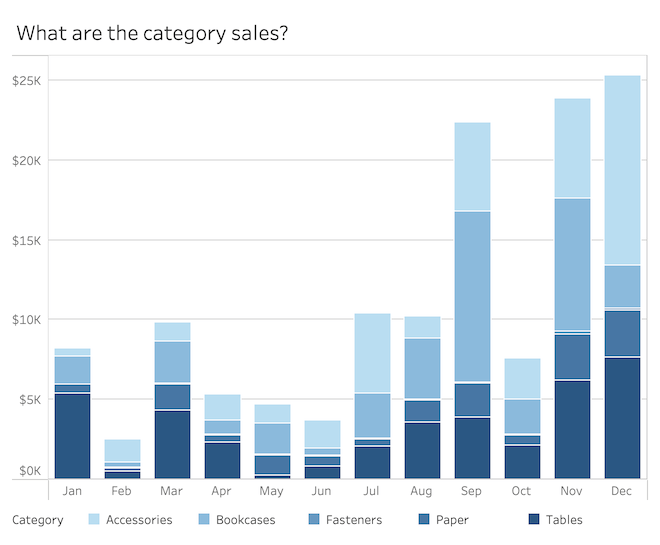
From Tableau Software’s dashboard showcase
The same blue (5F8DB6) is used for two different meanings. This confuses your reader’s brain because it thinks the blues are related – and they are not.


From Microsoft’s PowerBI dashboard showcase
The same three colors are used for three different analyses.

Building data literacy teams is that much harder when industry leaders perpetuate “bad behavior”
These few examples highlight the challenges to instill fundamental data literacy skills.
Consider this analogy. If I give you a word processor and teach you every feature, but teach you little or no English, you will not be able to write with any sense of literacy.
The same happens in the world of data visualization. A company makes a large software investment and may provide training on the basic use.
THEY TEACH YOU NOTHING ABOUT THE LANGUAGE OF VISUALIZATION
Ready to improve your data literacy?
- Schedule a free, no-sales-pitch, review » http://decisionviz.pro/review25
- Comment below – share your experience so others see they are not alone
- Rewrite your visualizations that have any of the three problems discussed
Excelsior!
Lee
Rewriting How People See Data™
Links to examples
Tableau showcase
PowerBI showcase
Frustrated By Low Dashboard Adoption?
Learn how to transform passive charts into action-oriented visuals.
